
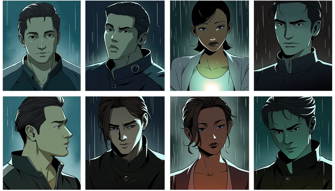
Animation decides how long you look at something. Comics do not. A reader can linger on one panel for a minute or cross a page in four seconds, and the artist's only control is the arrangement. In adult work that difference is enormous, because intimate scenes are almost entirely about timing and the reader is holding the clock. Everything interesting about the form comes from that one fact.
The gutter is where time happens
The white space between panels is not empty. It is where the reader fills in what happened between two images, and the size of that gap suggests how much. Narrow gutters read as continuous; wide ones read as elapsed time. Artists set the rhythm of a scene there without drawing anything.
In an intimate scene this is how anticipation gets built. Two panels with a wide gap between a hand raised and a hand landed makes the reader do the moment themselves, which is far more effective than showing the movement. The reader's imagination is always better cast than the drawing.
It is the print equivalent of the held frame described on the beat before the touch, and it costs even less.
Panel size is duration
Readers spend time in proportion to area. A full-page panel gets studied; a thumbnail-sized one gets glanced at. That means size is the artist's main volume control, and using it deliberately is what separates a paced scene from a uniform grid of equal boxes.
The common mistake in adult comics is giving the largest panels to the most explicit moments by default. Sometimes right, often wrong. A large panel of a face deciding something carries more than a large panel of an act, because the reader has been given time and something to think about in it.
Uniform grids have their place, usually to make a sequence feel mechanical or fast. Used unintentionally they flatten everything to the same emphasis, which reads as competent and forgettable.
The page turn is a cut
Nothing in comics is stronger than the moment a reader turns a page and cannot see what is coming. It is a genuine reveal, unavailable in any scrolling format, and adult comics squander it constantly by ending pages mid-sequence with nothing waiting.
Plan for it. Put the question at the bottom of the right page and the answer at the top of the left. Two panels, correctly placed, and the reader experiences an actual surprise. This is one of the things lost when a print book is ported to a vertical scroll, as covered on the vertical romance page.
Silence beats dialogue here
Adult manga is full of dialogue that exists because the artist was nervous about a silent panel. Most of it should go. A wordless panel of two fictional adults looking at each other communicates more than a line of speech and does not risk the tonal collapse that clumsy dialogue causes.
Keep speech for the moments that need a decision spoken aloud, which are usually the negotiation and the aftermath. In between, sound effects and silence do the job better, and the page looks less cluttered as a result.
What adaptations lose
When a book becomes an animation, the reader loses control of pacing and the director takes it. Scenes that worked because a reader lingered now run at a fixed speed, and the wide gutters that carried anticipation become either a held shot or nothing at all.
Good adaptations rebuild that timing with held frames and sound. Bad ones keep the events and lose the pauses, which is the failure described on how hentai shows are built across episodes.
What makes manga hentai work on the page
Gutters used as timing. Panel size used as emphasis. Page turns planned as reveals. Dialogue cut back to the moments that need it. Four decisions, all made at layout stage, all invisible when they work.
The characters remain fictional adults who are unmistakably grown, and the scenes still need visible agreement and an aftermath, which the form is unusually good at showing. The full standard is on the understanding of this house.