
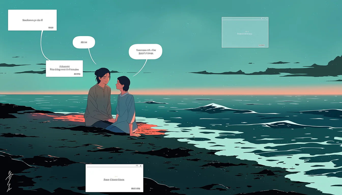
Comics spent a century designed for paper and then, within about a decade, a format appeared built for the thing people actually hold. Vertical scrolling strips, read top to bottom, in colour, on a phone. The adult romance corner of that format is now enormous, and it works for reasons specific to the shape rather than to the subject. Understanding the shape explains why so much of it reads slower and warmer than print adult comics do.
The strip replaces the page
There is no page, so there is no page turn and no layout in the print sense. What exists instead is a single tall column and the reader's thumb. Pacing is measured in scroll distance: how far you travel between one image and the next.
That trades away the reveal a page turn provides and gains something else, which is precise control over duration. An artist can put four screens of empty space before a panel and know that every reader will travel through all of it. Nobody can skip ahead by glancing at the opposite page.
The print-side comparison is on intimacy from panel to panel, where the gutter does a similar job in a much smaller space.
Empty space as a timing device
This is the format's signature move. A long stretch of colour, texture, or nothing at all before a significant panel. It costs almost no drawing and produces a genuine pause, because the reader has to physically scroll through it.
In romance it is the equivalent of a held breath. Used before a first touch or after a confession it lands hard, and used carelessly it just feels like padding. The difference is whether the space is doing something — building tension — or merely existing.
Colour helps here. A gradient shift across a long empty stretch changes the emotional temperature while the reader travels, which is a tool print never had in a usable form.
Why colour became the default
Print colour is expensive; screen colour is free. Once the distribution medium stopped charging for it, full colour became standard almost immediately, and with it came a different visual language: soft gradients, warm and cool contrasts, mood set by palette rather than by screen tone.
The shift also changed who could make comics. Screen tone and inking are specialist print skills; digital colour is closer to painting and attracted artists who had never worked in comics at all. A lot of the format's distinctive look comes from that influx rather than from any technical property of scrolling.
Adult romance benefits disproportionately. Skin tones, lamp light, dawn through a window — these are colour problems, and the format lets an artist solve them directly rather than approximating with hatching. It also means an entire chapter can carry a single palette that tells you what kind of night this is.
What the format costs
Two things. Composition across a wide frame is largely unavailable, since the reader only ever sees a phone-shaped slice. And the surprise of a page turn is gone, replaced by a scroll the reader controls, which means reveals must be built from scroll distance rather than concealment.
There is also a production cost. Vertical chapters are long, serialised, and colour, which is a heavy weekly load for a small team. Burnout in this format is a well-documented problem and it is part of why the night-studio routine exists.
Why slow romance suits it
Serialised chapters reward relationships that develop over time rather than resolve in one book. Space is cheap, so the quiet beats survive editing. Colour carries mood. And the phone is a private device read late, which matches the material's natural hour almost exactly.
Serialisation adds something print rarely manages, which is waiting. A week between chapters is a real gap in a reader's life, and it makes a slow-building relationship feel slow in a way a book read in one sitting never can. That is a structural advantage no amount of craft can substitute for.
Put together, the format is unusually well suited to work about two fictional adults slowly getting somewhere. That is the same territory described on the mood-first end of the genre.
What vertical adult romance does best
Long builds, controlled pauses, colour as emotion, and chapters that arrive at a rhythm. It is the first comics format designed around how people actually read, and adult romance turned out to be one of the things it does best.
The standard is unchanged by the format: fictional adults, unmistakably grown, visible agreement, credited makers. The connected studio for making vertical work sits at the night studio.